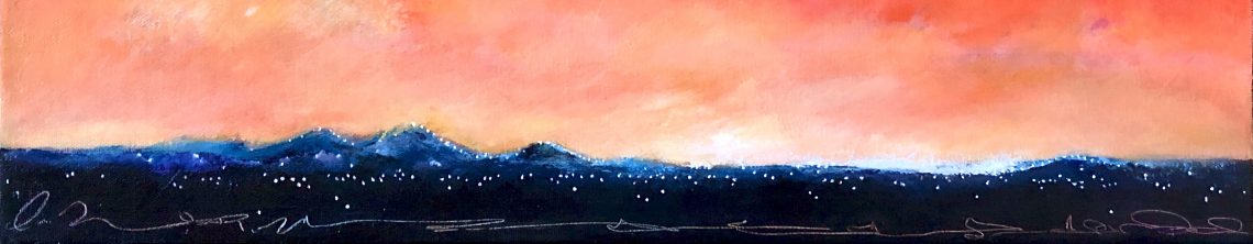

This painting was a risk for me. The entire palette is much darker than I usually use. At times, I thought it was too dark, so I continually moved it from my easel to the living room to outside and back again, adjusting the sky tones as needed. It remains a darker painting, but I love the way the “darkness” looks in my living room…it is a rather bright room, which helps.
I wanted the clouds to look loose and energetic. I found the perfect brush to use, quite large, but responsive to a brisk stroke. Also, as I have mentioned before, practice makes better.
I took this painting to the gallery last week. It does look darker than my others and, unfortunately, the gallery itself is rather dark, without any adjustable lighting or much natural light. SO…I may exchange it out when I complete another large piece, or find an easel to display it in a brighter spot. I am not unhappy that I chose to keep this a more somber piece and might try another in this palette in the near future…from the studio


Hi Sue, I think the “darkness” you speak about is what sets the mood of the painting. I happen to like the feeling it evokes. It does get dark when clouds like that are in our sky and especially if it is dusk. The vertical line of light you have on the ground takes your eye there and I think the viewer can feel the power of those clouds. Don’t stress. It’s perfect!
Carolyn
Carolyn, I love that you feel that way! Coming from you, a great compliment, not taken as flattery, but as support. I think the darkness I feel is seeing it with the other pieces in the gallery. I will email some photos to you. Sue